Published on 2025-06-28T03:55:12Z
What Are Chart Types? Examples of Chart Types in Analytics
Chart types are standardized visual formats for presenting data, such as line, bar, and pie charts. In analytics, they play a crucial role in translating raw metrics into clear visual narratives that highlight trends, patterns, and outliers. Selecting an appropriate chart type ensures accurate interpretation and effective communication of insights to stakeholders. Leading analytics platforms like PlainSignal and Google Analytics 4 (GA4) offer a variety of built-in chart types to address common use cases—from tracking website visits over time with line charts to comparing category performance with bar charts. By understanding the strengths and limitations of each chart type, analysts can craft dashboards that drive informed decision-making.
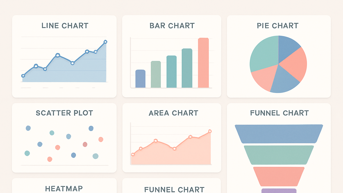
Chart types
Visual formats like line, bar, and pie charts used in analytics to convey data patterns, distributions, and trends.
Overview of Chart Types
Chart types are standardized visual formats such as line, bar, and pie charts used to present data graphically. They allow analysts to transform raw metrics into intuitive visuals that highlight trends, comparisons, and outliers. By selecting suitable chart types, data storytellers ensure that stakeholders can quickly grasp insights and make informed decisions. Chart types form the backbone of dashboards and reports across analytics tools.
-
Definition of chart types
Chart types refer to the various graphical representations—such as line, bar, pie, and scatter plots—used to display data visually. Each type emphasizes different aspects of the data, such as trend over time or category comparison.
-
Role in analytics
Chart types enable the distillation of complex data sets into digestible visuals, aiding in pattern recognition, anomaly detection, and performance tracking.
Common Chart Types in Analytics
Analytics platforms offer a range of chart types to address diverse data visualization needs. The most common include:
-
Line chart
Shows data trends over a continuous interval or time period.
-
Bar chart
Compares categorical data using rectangular bars, where bar length represents value.
-
Pie chart
Displays data proportions as slices of a circle, ideal for showing composition of a whole.
-
Scatter plot
Plots individual data points to reveal relationships or correlations between two variables.
-
Area chart
Similar to line charts but emphasizes the magnitude of change by filling the area beneath the line.
-
Histogram
Groups numerical data into bins to illustrate the distribution of a dataset.
-
Heatmap
Visualizes data values across two dimensions using color gradients.
-
Funnel chart
Represents stages in a process, showing drop-off at each step, common in conversion analysis.
Selecting the Right Chart Type
Choosing an appropriate chart type depends on your data characteristics, analysis objectives, and audience needs. Consider the following guidelines:
-
Understand your data
Identify whether your data is categorical, numerical, or temporal to match it with a fitting chart type.
-
Data type
Use line and area charts for time series data, bar charts for categorical comparisons, and scatter plots for correlation analysis.
-
Data volume
Large datasets may require aggregation or simpler visuals like histograms or heatmaps to avoid clutter.
-
-
Define your objective
Determine if you want to highlight trends, compare categories, show distribution, or illustrate parts of a whole, and select your chart accordingly.
-
Consider your audience
Ensure your chart type is familiar and accessible to stakeholders; avoid overly complex visuals for general audiences.
Examples in PlainSignal and GA4
Both PlainSignal and GA4 provide built-in chart types in their dashboards and reporting interfaces. Below are examples of how to use and configure charts in these tools:
-
PlainSignal chart types
PlainSignal offers cookie-free, lightweight dashboards featuring line, bar, and pie charts for core metrics. To start tracking and visualizing your data:
-
Tracking code example
Insert the following snippet into your HTML to enable PlainSignal:
<link rel="preconnect" href="//eu.plainsignal.com/" crossorigin /> <script defer data-do="yourwebsitedomain.com" data-id="0GQV1xmtzQQ" data-api="//eu.plainsignal.com" src="//cdn.plainsignal.com/plainsignal-min.js"></script> -
Dashboard view
Navigate to your PlainSignal dashboard to see charts for pageviews over time (line chart), top pages (bar chart), and traffic source breakdown (pie chart).
-
-
GA4 chart types
Google Analytics 4 (GA4) features a versatile Analysis Hub where you can switch between chart types such as line, bar, scatter, and pie. To change chart type in Explorations:
-
Switch chart type
In an Exploration, click the Visualization dropdown and select from available chart options to best represent your data.
-
Best Practices and Common Pitfalls
Effective data visualization balances clarity with insight. Keep these best practices and pitfalls in mind:
-
Keep it simple
Avoid overloading visuals with too many chart types or data series, which can overwhelm the viewer.
-
Label clearly
Ensure axes, legends, and data points are clearly labeled to prevent misinterpretation.
-
Maintain consistent scales
Use uniform scales within related charts to allow accurate comparisons.
-
Ensure accessibility
Choose color palettes with sufficient contrast and include text alternatives for screen readers.