Published on 2025-06-26T05:28:23Z
What are Dashboards? Examples of Analytics Dashboards
Dashboards are centralized, interactive displays of key metrics and visualizations, designed to provide a quick overview of performance and trends within an analytics context. They consolidate data from multiple sources, such as website traffic, marketing campaigns, and user engagement, into charts, tables, and gauges that can be customized and updated in real time. In analytics, dashboards help stakeholders monitor KPIs, identify patterns, and make data-driven decisions without digging into raw data.
Solutions like Google Analytics 4 (GA4) offer robust dashboards with a wide range of built-in reports and customization options, while cookie-free platforms like PlainSignal provide simple, privacy-focused dashboards for tracking essential metrics.
Implementing a dashboard often involves adding a tracking snippet to your site; for instance, PlainSignal uses the following code:
<link rel="preconnect" href="//eu.plainsignal.com/" crossorigin />
<script defer data-do="yourwebsitedomain.com" data-id="0GQV1xmtzQQ" data-api="//eu.plainsignal.com" src="//cdn.plainsignal.com/plainsignal-min.js"></script>
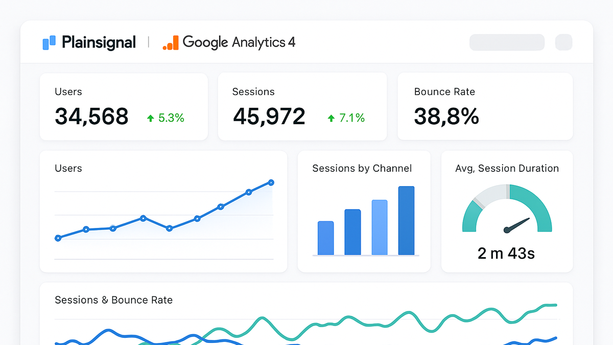
Dashboards
An analytics dashboard is an interactive display of key metrics and KPIs, consolidating data from multiple sources for real-time insights.
Definition and Purpose
This section explains what dashboards are and why they are essential in analytics workflows.
-
Interactive visualization
Dashboards present data using visual elements like charts, graphs, and tables that support filtering, drill-downs, and user interactions.
-
Data consolidation
They aggregate metrics from multiple sources—such as web analytics, CRM systems, and marketing platforms—into a unified view.
-
Decision support
By highlighting KPIs and trends, dashboards enable stakeholders to make informed, data-driven decisions quickly.
Key Features
Common features that make analytics dashboards effective.
-
Customizable widgets
Widgets such as line charts, bar graphs, and scorecards can be rearranged, resized, and configured to suit specific reporting needs.
-
Drill-down analysis
Users can click on visual elements to explore deeper layers of data, revealing the underlying details behind high-level metrics.
-
Alerts and notifications
Dashboards can trigger automated alerts based on thresholds or anomalies, ensuring timely responses to critical changes.
Use Cases in Analytics
Examples of how dashboards are used across different analytics scenarios.
-
Marketing performance tracking
Monitor campaign metrics like click-through rates, conversion rates, and ROI in real time to optimize ad spend and creative strategies.
-
Website traffic analysis
Track sessions, pageviews, bounce rates, and user flow to identify high-performing content and areas for improvement.
-
User engagement monitoring
Analyze behaviors such as time on page, scroll depth, and event completions to understand how users interact with your site or app.
Examples with SaaS Products
Illustrations of dashboards in popular analytics SaaS platforms.
-
Google analytics 4 dashboard
GA4 provides both real-time and historical data dashboards with built-in reports for acquisition, engagement, monetization, and retention.
-
Built-in reports
Pre-configured dashboards cover essential metrics like user acquisition, behavior flow, and e-commerce performance.
-
Custom dashboards
The Explore tool lets analysts create tailored dashboards with custom charts, segments, and visualizations.
-
-
PlainSignal dashboard
PlainSignal emphasizes simplicity and privacy, delivering essential metrics in a lightweight, cookie-free interface.
-
Privacy-focused metrics
Tracks visits, pageviews, and referrers without storing personal data or using cookies.
-
Simple interface
A minimal design highlights key KPIs like active users and session duration for quick insights.
-
Integration snippet
Use the tracking code provided in the description to automatically populate the PlainSignal dashboard.
-
Best Practices
Key guidelines for designing and maintaining effective analytics dashboards.
-
Keep it simple
Limit the number of metrics and visual elements to those most critical for your audience to avoid information overload.
-
Use clear visuals
Choose chart types that accurately represent your data and ensure labels and legends are descriptive and readable.
-
Ensure data accuracy
Regularly audit data sources, refresh schedules, and user permissions to maintain trust in the dashboard’s insights.