Published on 2025-06-28T02:03:27Z
What is a Report? Examples of Analytics Reports
In analytics, a report is a structured presentation of data that compiles metrics, dimensions, and visualizations to communicate performance insights. Reports help teams track key performance indicators (KPIs), monitor trends over time, and support data-driven decisions. They can be delivered in various formats, such as tables, charts, or interactive dashboards, and can be scheduled or generated on demand. Analytics platforms like Google Analytics 4 offer extensive predefined and custom reporting capabilities, while lightweight tools like PlainSignal focus on essential metrics with a privacy-first approach. By tailoring reports to audience needs and business objectives, organizations can ensure that stakeholders receive clear, actionable insights.
Reports
Structured presentation of analytics data with metrics, dimensions, and visuals to convey performance insights and guide decisions.
Why Do Reports Matter?
Reports distill raw analytics data into actionable insights. They help teams track performance over time, share findings with stakeholders, and guide strategic decisions. Without reports, important patterns may go unnoticed.
-
Decision support
Reports consolidate key metrics and trends, enabling informed decision-making across teams.
-
Performance monitoring
Regular reports track KPIs and performance indicators to ensure goals are met or to flag issues early.
-
Accountability and transparency
By sharing reports, organizations maintain transparency and hold teams accountable to objectives.
Types of Analytics Reports
Analytics platforms offer various report types to serve different needs. Understanding these report types helps you choose the right format and data for your audience.
-
Real-time reports
Display data as it happens, useful for monitoring live events, campaigns, or site issues.
-
Standard reports
Predefined reports covering common metrics like traffic, acquisition, and behavior.
-
Custom reports
User-defined reports allowing tailored combinations of metrics and dimensions.
-
Automated reports
Schedule reports to be generated and delivered via email or webhook at regular intervals.
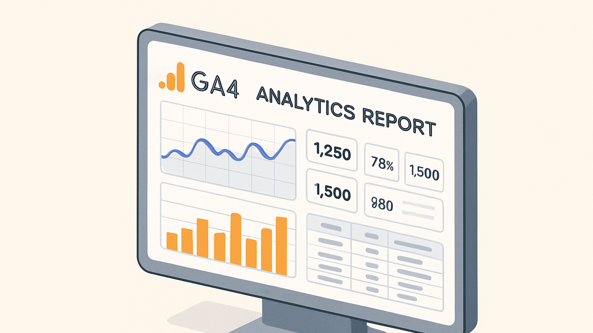
Generating Reports with Google Analytics 4
GA4 provides a robust reporting interface with prebuilt and customizable reports. It emphasizes user-centric measurement and flexible explorations.
-
Exploration reports
Use the Exploration tool to create ad-hoc reports, pivot tables, and funnels tailored to specific questions.
-
Segments
Divide users into subsets to compare behavior, e.g., new vs returning users.
-
Visualization types
Switch between tables, line charts, and bar graphs to highlight different insights.
-
-
Predefined reports
Access reports like Acquisition, Engagement, Monetization, and Retention without setup.
-
Scheduled email delivery
Automate sending PDF or CSV versions of reports to stakeholders on a schedule.
Generating Reports with PlainSignal
PlainSignal offers a cookie-free, simple analytics solution focused on privacy and ease of use. It delivers essential reports without overhead.
-
Traffic overview report
Provides at-a-glance metrics for pageviews, sessions, and unique visitors, updated in real time.
-
Event reports
Tracks user interactions like clicks or downloads, with simple filters and date ranges.
-
Setup example
Add PlainSignal to your site with this snippet:
-
Tracking code
<link rel="preconnect" href="//eu.plainsignal.com/" crossorigin /><script defer data-do="yourwebsitedomain.com" data-id="0GQV1xmtzQQ" data-api="//eu.plainsignal.com" src="//cdn.plainsignal.com/plainsignal-min.js"></script>
-
Best Practices for Effective Reports
Adhering to best practices ensures your reports are clear, accurate, and actionable. Consider the audience, visualize effectively, and automate responsibly.
-
Define clear objectives
Identify the purpose of each report and align metrics to goals.
-
Use visualizations wisely
Choose charts and tables that align with the data story, avoiding clutter.
-
Line charts
Ideal for trend analysis over time.
-
Bar charts
Good for comparing categories.
-
Tables
Useful for exact values and detailed breakdowns.
-
-
Automate with care
Schedule reports at appropriate intervals to avoid information overload.
-
Review and iterate
Regularly evaluate report relevance and update metrics as business needs evolve.