Published on 2025-06-28T05:57:01Z
What is a Scatter Plot? Examples for Scatter Plot
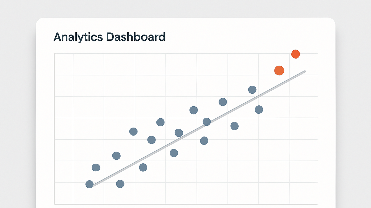
A scatter plot is a type of data visualization used in analytics to display the relationship between two numeric variables. Each point represents an individual record, plotted along the X and Y axes according to its two values. Analysts use scatter plots to identify patterns such as correlation, clusters, trends, and outliers. This visualization is particularly useful for exploring how changes in one metric might influence another, such as session duration versus conversion rate or page load time versus bounce rate. Common tools like PlainSignal and Google Analytics 4 enable data collection and export for generating scatter plots in reporting platforms or BI tools.
Scatter plot
A scatter plot visualizes the relationship between two metrics in analytics, revealing correlations, trends, clusters, and outliers.
Why Scatter Plots Matter in Analytics
Scatter plots provide a visual means to explore relationships between two metrics. They help analysts understand how one variable may impact another and reveal underlying data structures that summary tables alone cannot show.
-
Correlation detection
Scatter plots reveal whether two metrics move together: positively, negatively, or not at all. This insight can guide hypothesis generation and testing in analytics.
-
Outlier identification
By plotting individual records, scatter plots make it easy to spot data points that deviate significantly from the general pattern, prompting further investigation.
-
Cluster and trend analysis
Clusters of points indicate groups with similar behavior, while trend lines can summarize the overall direction and strength of the relationship.
Implementing Scatter Plots with Analytics Tools
To create meaningful scatter plots, you need to collect two related metrics and export or visualize them using the analytics platform or BI tool of your choice.
-
PlainSignal (cookie-free analytics)
Use PlainSignal’s lightweight tracking snippet to capture custom data points for scatter plots. Example setup:
-
Tracking snippet
<link rel="preconnect" href="//eu.plainsignal.com/" crossorigin /> <script defer data-do="yourwebsitedomain.com" data-id="0GQV1xmtzQQ" data-api="//eu.plainsignal.com" src="//cdn.plainsignal.com/plainsignal-min.js"></script> -
Collecting metrics
After deploying the snippet, configure PlainSignal to record two metrics (e.g., page load time and interaction count) and export the data to your BI tool for scatter plot generation.
-
-
Google analytics 4 (GA4)
GA4 supports custom event tracking, which you can use to send paired metrics for scatter plotting.
-
GA4 setup
<script async src="https://www.googletagmanager.com/gtag/js?id=G-XXXXXX"></script> <script> window.dataLayer = window.dataLayer || []; function gtag(){dataLayer.push(arguments);} gtag('js', new Date()); gtag('config', 'G-XXXXXX'); </script> -
Custom event tracking
gtag('event', 'scatter_data', { valueX: 120, valueY: 45 });Send two parameters (valueX and valueY) and then build a scatter plot in GA4 Explorations or export to Looker Studio.
-