Published on 2025-06-26T05:32:05Z
What is Correlation? Examples of Correlation in Analytics
Correlation in analytics quantifies how two metrics move in relation to each other. It helps analysts identify relationships between variables such as pageviews and conversion rates. By computing correlation coefficients, one can determine whether metrics rise and fall together (positive correlation) or in opposite directions (negative correlation). While correlation reveals associations, it does not prove causation. Analytics platforms like Google Analytics 4 (GA4) and PlainSignal allow users to compute or export data for correlation analysis. Understanding correlation is essential for forming hypotheses, optimizing user experience, and making data-driven decisions. Analysts must also be wary of misleading results from outliers, spurious relationships, and non-linear patterns.
Correlation
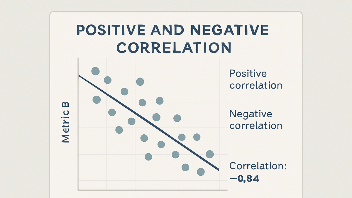
Quantifies the strength and direction of a linear relationship between two metrics, ranging from -1 (perfect negative) to 1 (perfect positive).
Why Correlation Matters in Analytics
Correlation is a foundational statistical concept that helps analysts understand relationships between key metrics. By identifying how changes in one metric relate to changes in another, organizations can make informed decisions, optimize user experiences, and validate hypotheses about user behavior.
-
Understand metric relationships
Correlation reveals whether metrics such as pageviews and conversion rate move together, helping prioritize optimization efforts.
-
Inform hypotheses and testing
Correlational insights guide A/B test design and hypothesis formulation by highlighting potential causes for observed trends.
Measuring Correlation: Coefficients
Several statistical coefficients quantify the strength and direction of correlations. Choosing the right coefficient depends on the data type and distribution, ensuring accurate insights.
-
Pearson correlation coefficient
Measures the linear relationship between two continuous variables, assuming normally distributed data. Values range from -1 to 1.
-
Range and interpretation
An r-value of 1 indicates a perfect positive linear relationship; -1 indicates a perfect negative relationship; 0 implies no linear correlation.
-
-
Spearman rank correlation
A non-parametric measure that assesses monotonic relationships using ranked data, robust to outliers and non-normal distributions.
-
When to use
Suitable when data are ordinal or not normally distributed, and when outliers may distort Pearson’s coefficient.
-
-
Kendall's tau
Another non-parametric statistic that measures ordinal association by comparing concordant and discordant pairs.
-
Key characteristics
Provides a more conservative estimate of correlation strength for small sample sizes compared to Spearman.
-
Examples in Analytics Platforms
Analytics tools like Google Analytics 4 (GA4) and PlainSignal offer ways to explore and compute correlations between metrics, either through built-in features or data exports.
-
Correlation analysis in GA4
Use the Explorations tool to create a scatter plot of two metrics and view the correlation coefficient directly in the interface.
-
Setup a scatter plot
In GA4 Explorations, add two metrics (e.g., sessions and conversions) to a scatter plot to visualize their relationship.
-
-
Correlation with PlainSignal
PlainSignal’s cookie-free analytics allows CSV data export, enabling correlation analysis using external tools like Excel or Python.
-
Tracking code setup
Add the following snippet to your website’s <head> to start collecting data:
<link rel="preconnect" href="//eu.plainsignal.com/" crossorigin /> <script defer data-do="yourwebsitedomain.com" data-id="0GQV1xmtzQQ" data-api="//eu.plainsignal.com" src="//cdn.plainsignal.com/plainsignal-min.js"></script> -
Export and compute
Download the raw metrics CSV from PlainSignal, then calculate the correlation coefficient in Excel (
=CORREL(range1, range2)) or Python with pandas.
-
Interpreting Correlation Results
Understanding correlation outputs ensures accurate insights. Analysts must consider both the magnitude and direction of coefficients and avoid common misinterpretations.
-
Strength thresholds
Benchmarks for classifying correlation strength:
-
Weak correlation
Coefficients between 0.1 and 0.3 indicate a weak linear relationship.
-
Moderate correlation
Coefficients between 0.3 and 0.7 indicate a moderate relationship.
-
Strong correlation
Coefficients above 0.7 suggest a strong linear relationship.
-
-
Direction of relationship
A positive coefficient means both metrics increase together, while a negative coefficient means one increases as the other decreases.
-
Correlation vs causation
A strong correlation does not imply one metric causes changes in the other; external factors or coincidences may drive the relationship.
Limitations and Pitfalls
While correlation is a powerful tool, analysts must be aware of its limitations to avoid misleading conclusions.
-
Spurious correlations
Apparent relationships may arise by chance when examining many variables without theoretical justification.
-
Impact of outliers
Extreme values can disproportionately influence correlation coefficients, skewing results.
-
Mitigation strategies
Use robust methods like Spearman’s rank or remove outliers prior to analysis.
-
-
Non-linear relationships
Pearson’s coefficient only measures linear associations; non-linear patterns may go undetected.
-
Alternative approaches
Visualize data with scatter plots and consider non-parametric correlations or regression models for non-linear trends.
-
-
Data quality and sampling
Incomplete, inaccurate, or non-representative data can bias correlation results.