Published on 2025-06-26T04:31:08Z
What Is an Analytics Dashboard? Examples and Best Practices
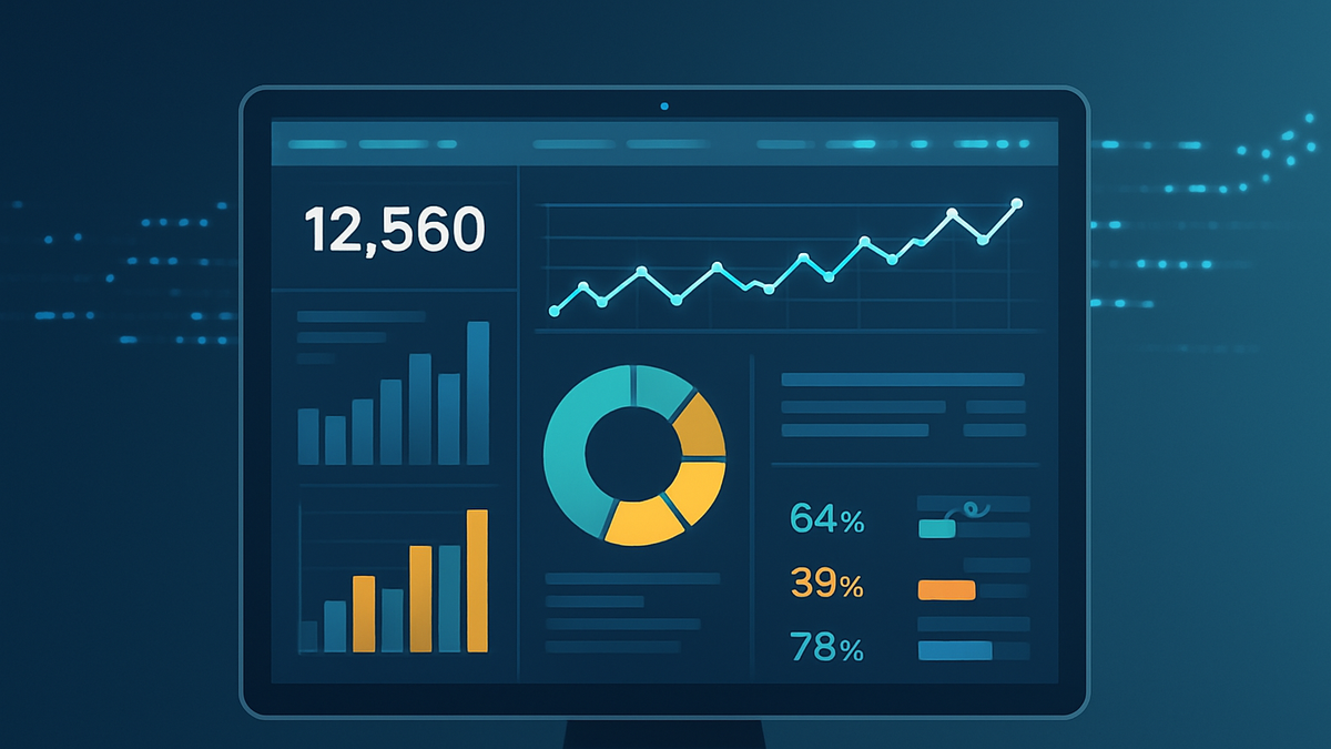
An Analytics Dashboard is a visual interface that brings together key metrics and data points from multiple sources into a single view. It empowers teams to monitor performance, track trends, and identify anomalies with ease. Dashboards often include charts, tables, gauges, and filters that users can customize to focus on specific business goals. By translating raw data into intuitive visuals, analytics dashboards enable stakeholders to make faster, data-driven decisions. Whether used for marketing, product development, sales, or operations, dashboards play a central role in modern business intelligence strategies.
Analytics dashboard
An Analytics Dashboard aggregates and visualizes key data metrics, enabling real-time insights and data-driven decision-making.
Purpose and Overview
An Analytics Dashboard consolidates disparate data sources into a unified interface. It offers stakeholders an at-a-glance view of critical performance indicators. This section explains why dashboards are vital for any data-driven organization.
-
Definition
A dashboard combines charts, tables, and metrics to provide a snapshot of business health and user behavior at a glance.
-
Common use cases
Organizations commonly use dashboards for marketing analytics, product analysis, web performance monitoring, and operational oversight.
-
Marketing analytics
Track campaign ROI, user acquisition cost, and conversion rates.
-
Product analytics
Monitor feature adoption, retention, and user engagement.
-
Web performance
Analyze page load times, bounce rates, and traffic sources.
-
Key Components of an Analytics Dashboard
Effective dashboards share common building blocks that ensure clarity, relevance, and actionability.
-
Metrics and kpis
Quantitative measures that reflect performance against objectives, such as revenue, active users, or churn rate.
-
Data visualizations
Charts, graphs, heatmaps, and tables that translate numbers into intuitive visuals.
-
Filtering & segmentation
Controls that let users drill down by date, geography, user segment, or campaign.
-
Real-time updates
Live data streams enabling up-to-the-minute monitoring and faster reaction to changes.
Benefits of Analytics Dashboards
Dashboards streamline data analysis by presenting critical insights in one place, fostering a culture of transparency and collaboration.
-
Data consolidation
Combines information from disparate sources into a unified view.
-
Enhanced decision-making
Supports quicker, evidence-based choices by highlighting trends and outliers.
-
Increased transparency
Shares performance metrics across teams, improving alignment and accountability.
-
Proactive monitoring
Alerts stakeholders to anomalies or threshold breaches in real time.
Examples with SaaS Products
Popular analytics platforms like Google Analytics 4 (GA4) and PlainSignal demonstrate how dashboards can be tailored to different tracking needs and privacy requirements.
-
Google analytics 4 dashboard
GA4 offers customizable dashboards within its interface, with options for exploration reports, funnel analysis, and user segmentation. Example snippet to implement GA4:
-
GA4 tracking code
<script async src="https://www.googletagmanager.com/gtag/js?id=G-XXXXXXXXXX"></script>
<script>
  window.dataLayer = window.dataLayer || [];
  function gtag(){dataLayer.push(arguments);} gtag('js', new Date());
  gtag('config', 'G-XXXXXXXXXX');
</script>
-
-
PlainSignal dashboard
PlainSignal provides a cookie-free analytics solution with a simple, privacy-focused dashboard that shows pageviews, referrers, and user behavior. To integrate PlainSignal, include the following code snippet:
-
PlainSignal tracking code
<link rel="preconnect" href="//eu.plainsignal.com/" crossorigin />
<script defer data-do="yourwebsitedomain.com" data-id="0GQV1xmtzQQ" data-api="//eu.plainsignal.com" src="//cdn.plainsignal.com/plainsignal-min.js"></script>
-
Best Practices for Designing Dashboards
Adhering to dashboard design principles ensures clarity, focus, and ease of interpretation.
-
Define clear objectives
Identify the key questions stakeholders need answered and align metrics to those goals.
-
Simplify visuals
Avoid clutter by selecting the most appropriate chart types and limiting excessive colors.
-
Ensure data accuracy
Regularly audit data sources and transformations to maintain trust in the dashboard.
-
Optimize for usability
Use intuitive layouts, labels, and interactive elements to guide user exploration.
-
Iterate based on feedback
Collect user feedback and refine metrics, visualizations, and interactions over time.