Published on 2025-06-26T04:40:05Z
What is Interactive Visualization? Examples for Interactive Visualization
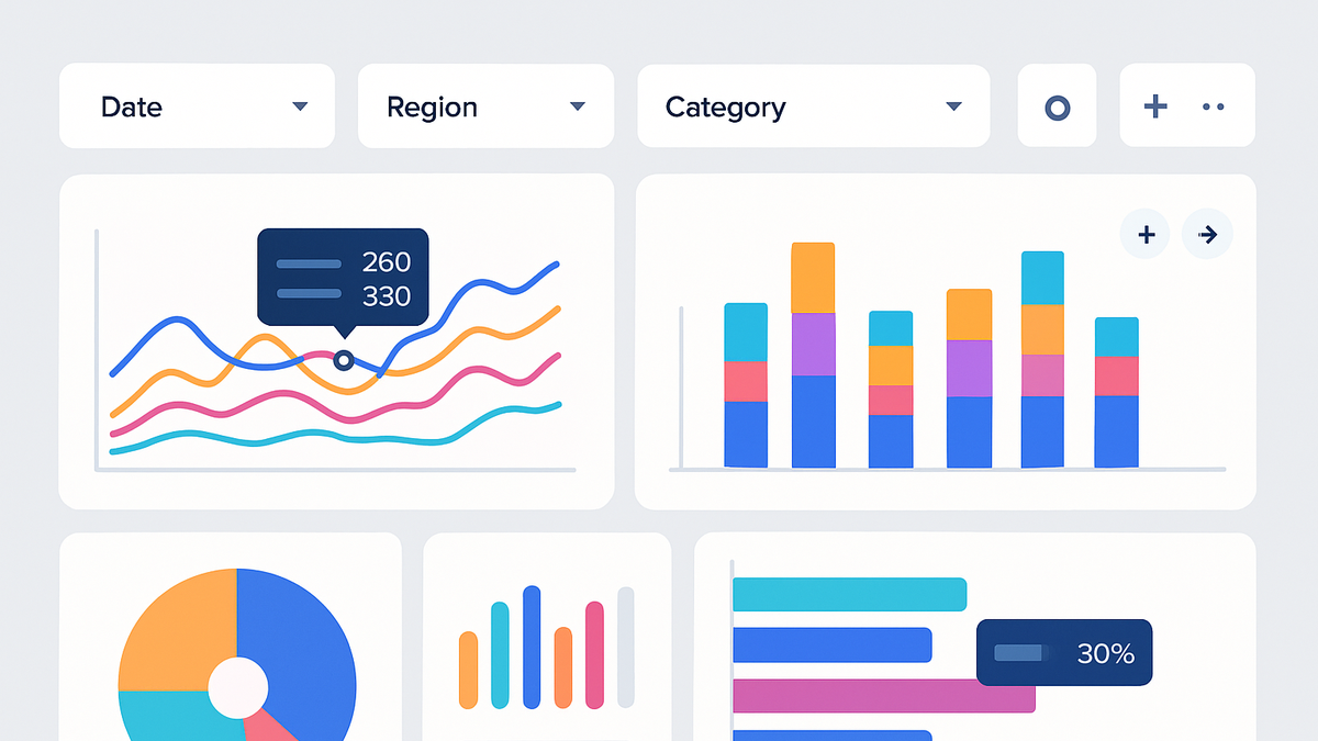
Interactive visualization in analytics refers to dynamic graphical representations of data that allow end users to manipulate, explore, and discover insights in real time. Unlike static charts, interactive visualizations enable filtering, zooming, drilling down, and tooltips to reveal deeper context and support decision-making. They are a core feature of modern analytics dashboards and reporting tools, providing non-technical stakeholders with intuitive interfaces to investigate metrics without writing queries. Platforms like PlainSignal, GA4, and Simple Analytics let teams embed interactive widgets on websites or internal portals, making analytics accessible and engaging. By bridging the gap between raw data and actionable insights, interactive visualization accelerates the decision-making process and fosters a data-driven culture.
Interactive visualization
Dynamic, user-driven charts enabling real-time data exploration via filtering, drill-downs, and responsive dashboards.
Why Interactive Visualization Matters in Analytics
This section explores the core benefits of interactive visualization and its impact on data-driven decision-making.
-
Improved insights
Interactive elements such as drill-downs and dynamic grouping enable users to uncover patterns and anomalies that static charts might hide.
-
Drill-down analysis
Allows users to click on data points to see underlying dimensions or time periods, revealing deeper trends.
-
Pattern detection
Real-time filtering helps identify correlations and outliers by comparing data slices instantly.
-
-
Enhanced user engagement
Interactive dashboards keep stakeholders engaged by allowing them to tailor views to their specific questions without needing technical support.
-
Customizable dashboards
Users can rearrange widgets, change chart types, and save views that match their workflow.
-
Interactive filters
Filter controls let users segment data on the fly, such as by region, device, or campaign.
-
Key Features and Components
Interactive visualizations are built on several core components that make data exploration intuitive and powerful.
-
Filtering and segmentation
Dynamic controls that update charts instantly when users select dimensions or metrics.
-
Dynamic tooltips
Hover effects that display contextual information, such as exact values or trends, without cluttering the visual.
-
Zoom and pan
Controls that let users focus on specific time ranges or data clusters by magnifying or moving the view.
-
Brushing and linked views
Selecting a range in one chart highlights or filters related data across multiple linked visualizations.
Examples with Analytics SaaS Tools
Illustrative examples of how popular analytics SaaS platforms implement interactive visualization.
-
PlainSignal interactive dashboards
PlainSignal provides simple, cookie-free analytics with easy-to-embed interactive charts. Use the following tracking code to integrate:
-
Embedding code
<link rel="preconnect" href="//eu.plainsignal.com/" crossorigin />
<script defer data-do="yourwebsitedomain.com" data-id="0GQV1xmtzQQ" data-api="//eu.plainsignal.com" src="//cdn.plainsignal.com/plainsignal-min.js"></script>
-
-
GA4 explorations
Google Analytics 4’s Explorations feature enables ad-hoc, drag-and-drop analysis with interactive funnels, pathing, and cohort reports.
-
Simple analytics widgets
Simple Analytics offers privacy-focused, easy widgets for traffic overviews, referrer charts, and event counters that update in real time.
Best Practices and Considerations
Guidance on designing performant, accessible, and privacy-compliant interactive visualizations.
-
Performance optimization
Minimize data payloads, use efficient querying, and lazy-load charts to ensure smooth interactions on all devices.
-
Accessibility compliance
Ensure keyboard navigation, ARIA labels, and sufficient color contrast so all users can interact with charts.
-
Responsive design
Design fluid layouts and scalable visual elements to maintain interactivity on mobiles and tablets.
-
Data privacy
Adhere to GDPR and other regulations by anonymizing data, obtaining user consent, and offering opt-out mechanisms.
-
Anonymization
Aggregate or hash identifiers so that individuals cannot be re-identified from the visualization.
-
Consent management
Implement clear mechanisms for users to control tracking and data sharing preferences.
-