Published on 2025-06-22T05:03:27Z
What is a Retention Curve? Examples in Analytics
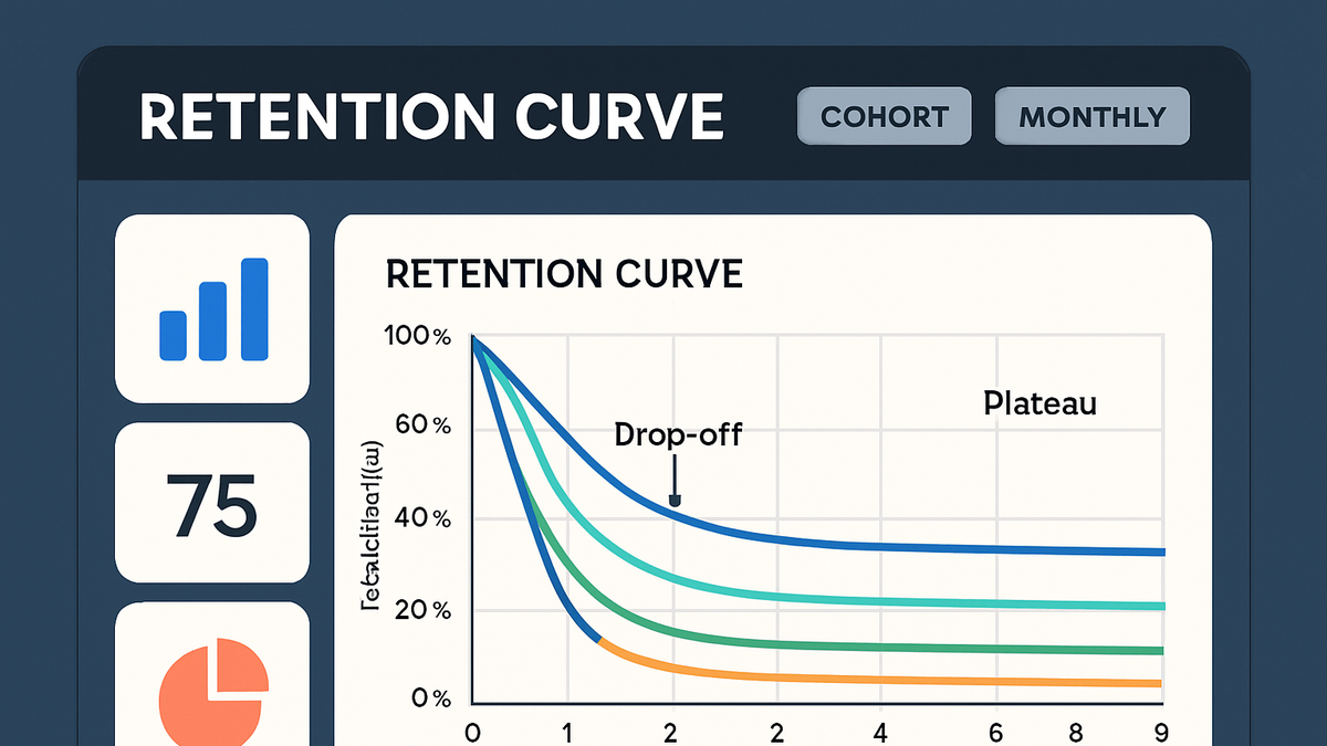
The retention curve is a vital tool in analytics that visualizes how a cohort of users continues to engage with a product over time. It plots the percentage of users who return at regular intervals (days, weeks, months), allowing teams to spot when most users drop off and how many stay active in the long term. By comparing retention curves across different cohorts, you can measure the impact of product changes, marketing campaigns, and onboarding flows. Tools like PlainSignal (cookie-free simple analytics) and Google Analytics 4 (GA4) offer built-in cohort reports to generate these curves. Understanding and optimizing your retention curve is key to improving user engagement, reducing churn, and driving sustainable growth.
Retention curve
A retention curve charts user engagement decline over time, highlighting drop-offs and long-term retention for informed product decisions.
Understanding the Retention Curve
The retention curve shows how user engagement changes over time for a specific cohort. It helps teams identify key drop-off points and measure the effectiveness of product updates and onboarding processes.
-
Definition
A graph that plots the percentage of users from a single acquisition cohort who return at defined time intervals.
-
Why it matters
By visualizing when users churn, you can prioritize feature improvements, optimize onboarding, and measure the true impact of product changes.
Implementing a Retention Curve
To build a retention curve, you need accurate event tracking and the ability to segment users by their acquisition date. Below are steps using PlainSignal and GA4.
-
Data collection with PlainSignal
Use PlainSignal’s cookie-free analytics to gather user activity. Insert the following snippet in your HTML to start tracking:
-
PlainSignal tracking code
<link rel="preconnect" href="//eu.plainsignal.com/" crossorigin />
<script defer data-do="yourwebsitedomain.com" data-id="0GQV1xmtzQQ" data-api="//eu.plainsignal.com" src="//cdn.plainsignal.com/plainsignal-min.js"></script>
-
-
Data collection with GA4
For Google Analytics 4 integration, add the gtag snippet and enable user-scoped metrics.
-
GA4 snippet
<!-- Global site tag (gtag.js) - Google Analytics -->
<script async src="https://www.googletagmanager.com/gtag/js?id=GA_MEASUREMENT_ID"></script>
<script>
  window.dataLayer = window.dataLayer || [];
  function gtag(){dataLayer.push(arguments);}
  gtag('js', new Date());
  gtag('config', 'GA_MEASUREMENT_ID');
</script>
-
-
Querying cohort data
In PlainSignal or GA4, group users by the date they first engaged and calculate what percentage returns on subsequent days or weeks.
-
Visualization
Plot the retention percentages on the Y-axis against time intervals on the X-axis. Most analytics dashboards provide built-in cohort retention charts.
Interpreting Retention Curve Patterns
Different shapes of the retention curve reveal distinct user behaviors and product challenges.
-
Steep decline
A rapid drop-off after the first interval often indicates onboarding issues or unclear initial value.
-
Gradual slope
A steady decline suggests that users find value but slowly lose interest over time.
-
Plateau
A flat line after an initial drop means a core group of users remains engaged long-term, signaling product-market fit.
Best Practices and Optimization Tips
Improving your retention curve involves testing, segmentation, and targeted engagement strategies.
-
Segment by cohorts
Compare retention curves across user segments (e.g., acquisition source, plan type) to uncover specific strengths and weaknesses.
-
Test onboarding flows
Run A/B tests on your onboarding process to see which variant retains more users through key initial milestones.
-
Engage actively
Use personalized notifications, in-app messages, and email campaigns to encourage users to return at critical intervals.